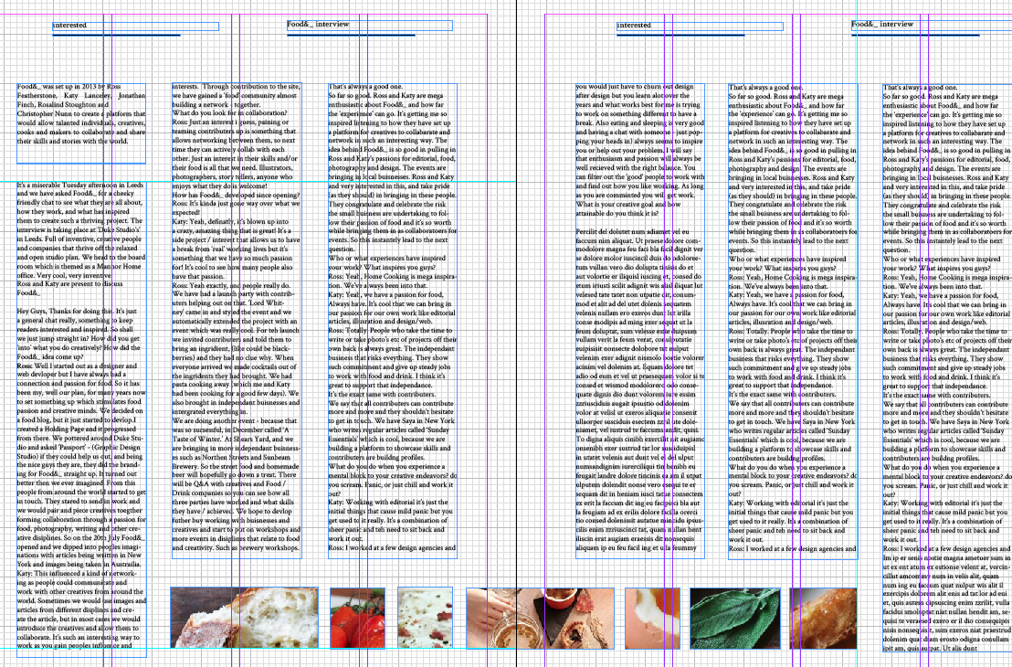
I had some difficulty with developing the layout. This is a very early draft of the potential layout which I feel needs a lot of work. The design focus on experimental layout.
I want the pages to include a variant of interview and text to allow the audience to actually read the content and learn / be interested in...
I feel that these pages look too text heavy. The interview needs to be more spread across the pages to allow for a simple and easy read.
The image layout is becoming more and more difficult with more I had into it.
I feel that the layout is too busy for the design.
Contents page layout:
The contents needs to be simple, coming straight from the front cover I feel it could look overworked and crammed. The design includes a combination of image and text but may have to be re-wroked in order to fit with the theme and content.
I quite like the layout of the food& interview. The images work well in a uniform fashion. 2/3 image per page could work in terms of spacing and allow for the visuals to not be too crammed.
I need and introduction page to each interview. I feel that taking up the page might include too much negative space which could look unbalanced comp read to the busier pages.
I think I need to re-think the layout and placement of specific pages.


No comments:
Post a Comment