Saturday 10 May 2014

Poster and postcard research : Extra for Zine pack


I started to research posters ad postcard colours layout image and type for the poem books. Although we rant doing a digital element i thought to would be appproatcie to see f we could gage any design inspiration from the above. 
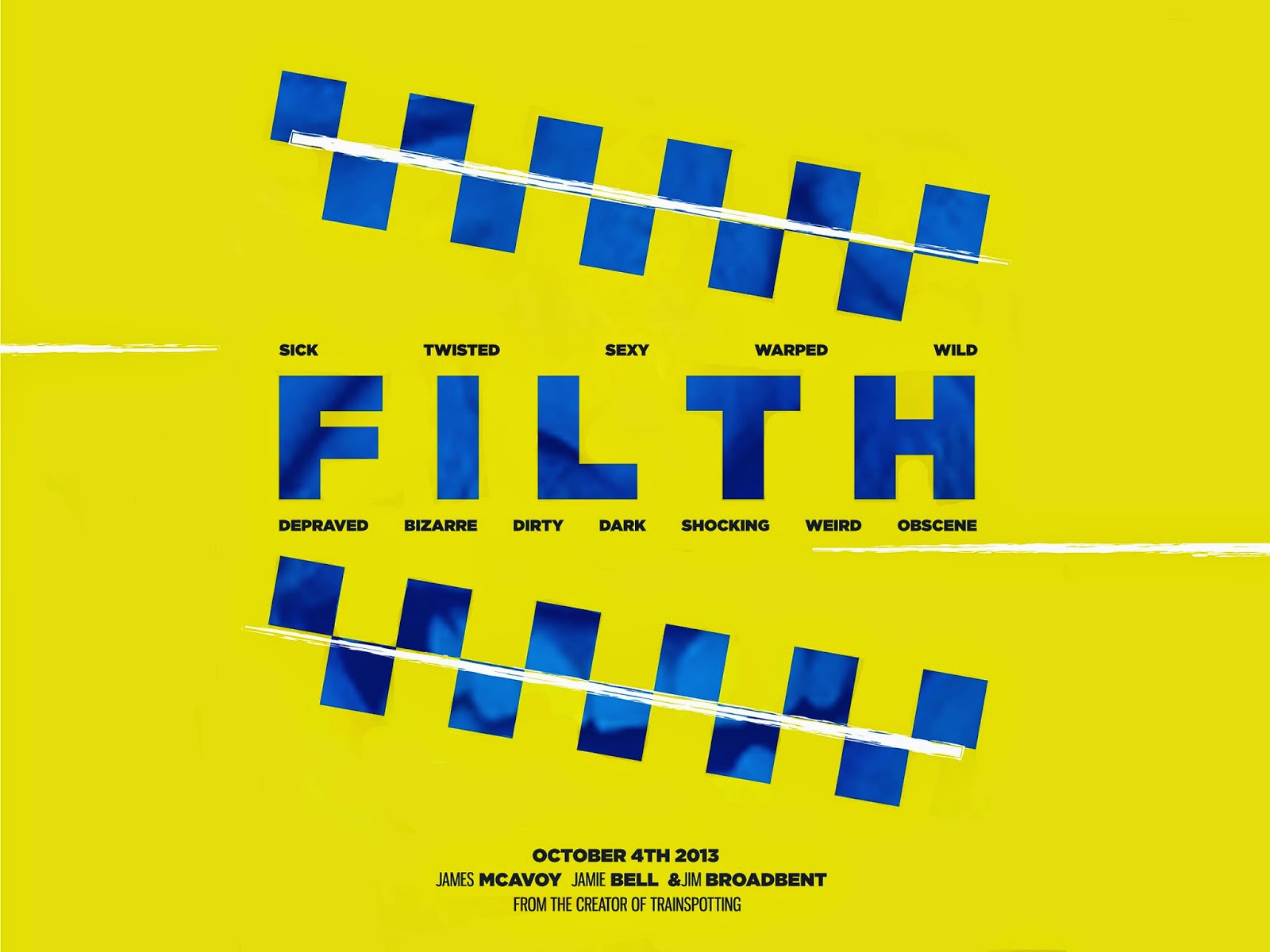
Elmwood Portfolio Crit

I recently had a crit of rmy portfolio. 

This is some sections from the the portfolio I showed to Steph from Elmwood


Steph gave me some great feedback that will improve my design and layout. overall i THIN SHE THOUGHT THAT i HAD IMPROVED SINCE TEH LAST TIME i SAW HER. i was really happy with the feedback i received and thought that the overall presentation was good. 


Stephs Feedback:

FILM2014 BRIEF : use 4 big images so you can explain and clearly see visuals 

CHAMPNEYS : Fave and body i page for each - take off 1st images

work on application to make it look more like pattern prints :large scale to us colour and thick line around app layout.

LTA - logi is tiny needs to be larger with white background

TV screens > Cinema > screens show concept 1 or 2 rooms or corridor.bathroom concept explain who this would moves

App for cinea: mae the edges round like tickets to link to web

Full part tern for title page - champneys
discribption on piety book layout + band big on there. 


I am really please with the feedback and will work on this to improve my portfolio as it all be better for orfeesional use. I incorpeted brief that I felt were relevant to my ucrret design practice. 

Talenthouse - FInal mock ups

I thought that mocking up the poster in different context would allow it to relate ego the film more. The design works across a medium of products:

The video: This would be the background image for the trailer and would fade out when the trailer started. 


I attempted to mock up the design onto a t-shirt then realised i could take sections out instead of putting the full design on the tshirt. it looks quite cheap and basic but I think if i edited it more it could look ok. 


Putting the designs on mock up poster, It allowed em to expiremt with placement and using sections that could be developed with just shape and to stand alone because ethe concept would carry the designs across. 


I think these work to portray the variety of places the poster could be seen in order for promotional convince.


Talenthouse - Final Poster


The design focuses round the poise research i undertook an then uses white lines to represent the drug use within the film. i PLACED A GRADIENT ON THE BLUE CHEKCaRD DESIGN SECTIONs to gee them more depth and charter. Then i used an image to overlay the image and title. 

I am quite happy with the final design and feel that it works with the conenpt. 
iF I HAD MORE TIMe i would work more with the design and create maybe a not so gridded outcome. However I do think the design looks quite professional. 

Friday 9 May 2014

Research - A collection of research for my


Talenthouse Initial concepts and Ideas

The public poster for the movie:


The brief asked to use original colour scheme and too keep the logo the same. The could work with my design: These are the official posters for the movie:


The logo is very bold and works well to reflect the bold impact the film creates. 
Th eoclour scheme is quite bright but it also reflects th punchy reflective tone of the film. 


I really wanted to create a strong concept with this brief. After researching way the film was about i watched the trailer. The trail portrayed the films main character in a deceiving way.

the main character has two sides almost. He is a police officer who is extumly corrupt. I think this would be a great starting point to base my concept around. I think this would be stmui for colours, patterns, visuals and copy to help portray this.  


As a starting point to get me into working ith posters again I decided to create a collage of movie characters. I thought this would due a good way to explore image layout and also allowed me to work with manipulation.


This design works well to pull together aspects of film and has allowed me to get back into design potters. I think the design I need to create needs to highltiht subtle messages to work ith the concept. Even taken shapes of from the poise uniform and using it wil bold type could really push the design. 


I wanted to stick with the original colour scheme of the bright yellow design. I figured i could incorporate this with the bold type and the colours of the police to represent the main charter.  


The colour scheme reflects the more 'normal' day to day perception of the main character whereas the bright background indulges the characters more wild side. i thought this would be an effective way to reprint my concept and the film. 


Thursday 8 May 2014

Talenthouse - Filth Research

Plot[edit]

Bruce Robertson (James McAvoy) is a Detective Sergeant in Edinburgh; a scheming, manipulative, misanthropic man who spends his time indulging in drugs, alcohol, sexually abusive relationships, and "the games"—his euphemism for the myriad foul plots he hatches directed at workmates. Robertson also delights in systematically bullying and taking advantage of his mild mannered friend Clifford Blades (Eddie Marsan), a member of Robertson's masonic lodge whose wife he repeatedly prank calls and harasses as part of one of the games (transgressions for which he ultimately frames Blades himself).
Robertson's main goal in life is to gain promotion to Detective Inspector, the path to which appears to open when he is assigned to oversee the investigation into the murder of a Japanese student. He slowly loses his grip on reality as he works the case, however, suffering from a series of increasingly severe hallucinations. These hallucinations become worse as the film gets closer to the end and Bruce descends into insanity. It is ultimately revealed through dream-like exchanges with his psychiatrist (Jim Broadbent) that he is on medication for bipolar disorder, and wracked with guilt over a tragic accident which led to the death of his younger brother at some point in his childhood. It also becomes clear that his wife had left him for another man some time prior to the film's events and is denying him access to his daughter, developments which sparked his desperate bid for promotion, and also led him to start dressing as his wife when off duty in order to 'keep her close to him'.
While wandering the streets on such an occasion, Bruce is taken by the gang responsible for the murder (which it is revealed that he witnessed at the start of film, but could not report to his colleagues for fear of disclosing his crossdressing and problems at home) and badly beaten. He manages however to kill the leader by throwing him out a window, and is found by his colleagues. Robertson not only misses out on the promotion as a result of the events, but is in fact demoted to Constable and is reassigned to uniform, while rookie Ray Lennox (Jamie Bell) is promoted to Detective Inspector. The film closes with Clifford watching a tape—that was left for him upon his release from jail—of Bruce apologising. Bruce then prepares to commit suicide by hanging himself, but is interrupted by a woman and her son (two characters whom he'd met several times before) knocking on his front door. He then breaks the fourth wall and addresses the audience repeating his slogan—"Same rules apply"—and then the chair breaks under him.

Cast[edit]


Filth (I) (2013)

  -  Comedy | Crime | Drama  -  24 April 2014 (USA)
7.1
Your rating: 
  -/10 
Ratings: 7.1/10 from 33,330 users   Metascore: 69/100 
Reviews: 75 user | 146 critic | 10 from Metacritic.com
A bipolar, bigoted junkie cop manipulates and hallucinates his way through the festive season in a bid to secure promotion and win back his wife and daughter.

Director:


Writers:

  (screenplay),  (novel)