Saturday 29 March 2014

Getting Together

So today em and Chris met up and discussed the poem book. We had left it for a while as we both had deadlines for YCN and D&AD. We wanted to make sure that the designs and poems we had creted so far worked for our plans and to see if we were sell on the she page.


Heres some of my designs:


Heres some of Chris:


Chris style of illustration differs from mine and we thought this could create quite a nice contrasts within our work. 

We really want to keep the work vey illustrative. Laura Dockrills work seems to always come across professional as well as 'scribbled' and illustrative aesthetic. 

We have decide that we are going to edit the designs before we start to bind the documents. We want to add different stocks to create the book. 


We have both decided that war are on the right page.
However we have opened up the book concept father by allowing anything to do with the teem celebrity. It no longer has to be just a poem. 

YUM - Boards

YUM BOARDS

I have created some final boards to show the progression of the brand. I feel that they could do ith some work however as i feel that i haven't included much on the development of the brand. 

I would also like to spend more time on the website section of this brief 


I feel that the full screen images really work well on my bards as you can see the detail in the images and how the business cards and products have been made. I feel that minimum type works with the images also, as it gives a little information. 


Personal Branding - Research

Identity Research

I have strated to collect some images that i feel would describe me as a designer. 

The things I like:

- Colour
- Simple / Minimal 
- Shape


I really like the finish on these business cards. The idea of 3 layers works well to make the card look professional and the colour scheme ties in perfectly with the finish. The business card looks fun yet fresh and cleverly designed.


Adding colour to my branding is curtail. I tend to work with colour quite a lot so it would be a good way to incorpate my design. 


Using bold text and type. Keeping it simple with a bold typeface and colour scheme. The business card looks very corporate, legible and professional. 


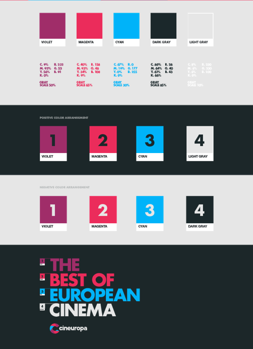
Playing with colour schemes. The colours i select need to be perfect for my design. I tend to struggle making decisions for my own branding, so going through a number f colours will allow me to select the best designs. 


The identity range needs to be pushed. Once I have my logo and cooer scheme I can push the designs into effective print and web collateral. 


Looking at logo development

This brand has worked with physical forms and digitally enhanced the designs. 


Adding colour


It's really useful to see the development and stages of creating a brand. I think i really need to push this and too keep in my my personality and design style. 

The tesco branding is effective in communicating a light hearted tone of voice. its humour and colour brighten up the shop layout and appeals to a broad audience. 


I have collected some images of brands and identities. I think it's really usuful to collect a variant of images and colours to bring into my designs. I have focused on brands seeing as I am branding myself. The range varies but identity is a critical part. 

Tuesday 25 March 2014

Yum - Photography Re-take

I feel as though my last shoot didn't turn out right so decided to bring in Anna a 3rd year photography student to take some close ups and better photographs for me ….


I feel that these images look more professional. I'm very glad that i decided to re-shoot the brand because the images have allowed a better revised visual.