Saturday 22 February 2014

Tennis Campaign Research

Since I am looking at Tennis and women i thought it would be effective to produce research on tennis campaigns. Most of the campaigns use iconic images of women tennis players and right colours. I think this is effective as it creates a positive outlook on women and tennis. 


Within the designs there is always an aspect of light and heavy editing. I would like to stay away form this as i think it can look like cheap design. 

I also don not want to crete a print camping and feel that if i use digital aspects i could promote tennis in a more effective way. 

Champneys : Initial Pattern Designs


Once we had the design for the logo we thought that we should start designing and experimenting to create a range of products. This could work within spa and high street shops for our target audience. On the website we noticed there was a "coming soon" section so we thought that we could utilise that for THE GOOD STUFF.
We decided straight away that we would create a bold and unique pattern that would attract a younger audience, as the current Champneys packaging is quite dated, and aimed towards the older woman. We felt that a floral pattern would be most appropriate, however we wanted to take inspiration from The Library of Flowers and create something vivid and eye catching, not soppy and girly. A hand rendered aesthetic seemed most appropriate, as it would create a playful design, therefore myself and Steph began to draw up some flower illustrations that could be used. As illustration is something that interests us both, we felt that it was appropriate for us both to contribute to this area.


Unfortunately the illustrations didn't come out great once scanned in, even at a high dpi. I therefore suggested that seen as we were planning on adding colour anyway, that we simply traced a selection of the images using the pencil tool, to keep the hand rendered style, so that we could add colour and experiment with the visuals. I began to trace round the images in a similar style and began to explore different colour possibilities, using a vivid colour palette. 


Friday 21 February 2014

Champneys : Layout + Pattern Experiments

Pattern Development 

After drawing out all the designs we decide to add colour and both go away and create some patterns.

We selcted a colour pallet and decided to come back in a few hours when we had a unique and good pattern. 

These are my experiments:


BETHS FEEDBACK ON MY PATTERNS / LAYOUT:

Beth said that the design layouts were effective but they looked quite corporate and slightly old for th intenetd target audience.

I thought this was good feedback as it allowed us to look at the colours used and change certain aspects. 

We started to bring in colour pallet and regularly updated our experiments on dropbox

It took us quite a while to develop this as we wanted the design to be quirky and fun! 
We used illustrator to make the illustration by quickly drawing around the shapes in a bld book colour. This added depth and allowed us to keep it dun and not so serious. 

Original Colour Scheme


Initially, I liked the first pattern Beth had came up with, however I noted that the colour scheme wasn't quite working and Beth agreed.

These are Beths Initial Pattern experiments:


CHANGE OF PLAN

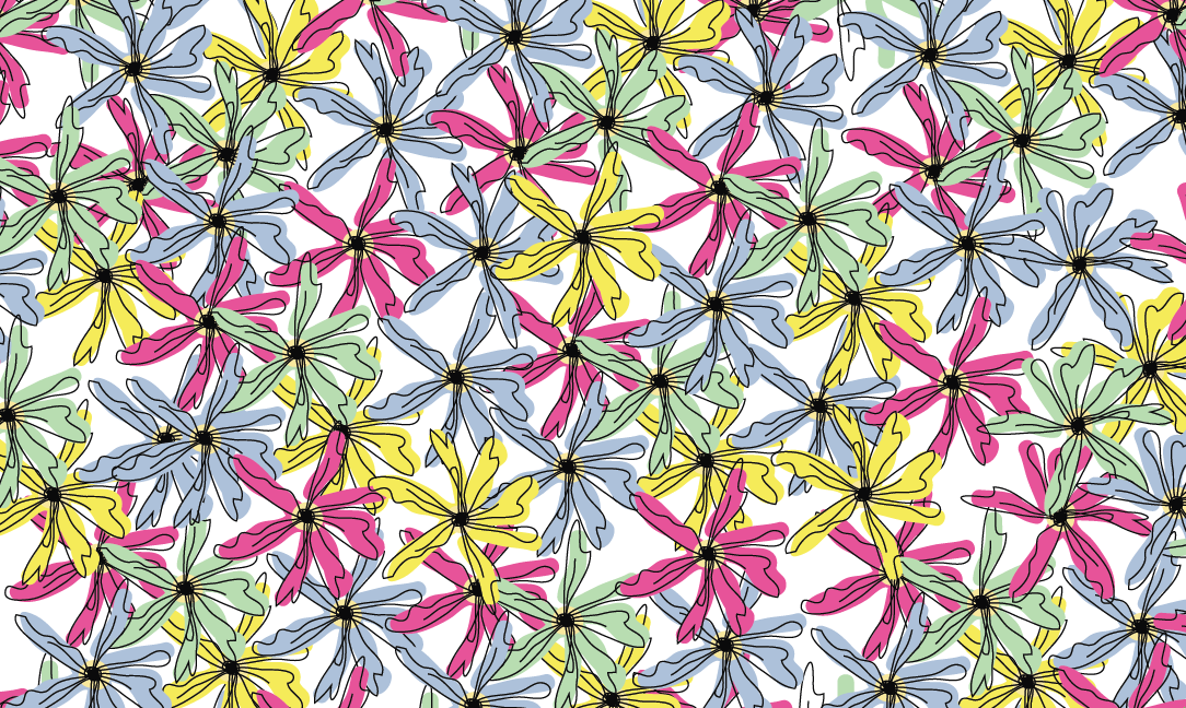
After this discussion, we decided to swap some of the colours and bring in some new ones. We wanted a non-garish colour scheme so we decided to work with pastel colours: 


Adding in a tone of green could allow us to use it for steams and leafs as well as the centre of a flower. 


Overlapping the design : Experimentation


Background


We decided that we needed a background for the image as it was looking quite bare and some ext a lines could gee the pattern some depth, however we dint want the design to look over crowded. 
We both agreed that this improved the pattern: 

PATTERN 2: 

As we are creating products for both skincare and body care, we decided that it would be more effective to have two different patterns that could be applied to the two different ranges.

We wanted to make this pattern busy. We had to add in a background to the previous pattern so we thought we should remove the long steams and focus on the shapes we had designed

Beth created this overlapping pattern: 


My response to Beths design: 

The design works very well. It is fun, vibrant and offers change from the other design. The bright colours would look effective when printed and the allows the Champneys range to target a younger generation. 

YUM - Product Labels

Initial Label Designs:

Trying to be in keeping with the homemade approach I hand rendered some designs. I wanted it to look like a scribble effect.

I soon realised that the design didn't work with the YUM brand and seemed to bring the professional aspect down. I feel that if i included some for of image and colour and the original LOGO it could enhance the tags.

I tried to get out of the original shape and style of the tag, I feel this could of been interesting but after these experiments I would prefer to keep it in a retcnage shape. 


To develop the range further I had to start creating labels for the condiments.

I wanted to create a simple and clear design. I have included blurred photos to back up the label and make it look professional.  


I feel that theses labels work quite well in terms of working with the YUM branding. The designs are very simple and have a tear away section that allows the audience to write messages to people they are purchasing the condiments for or a little thanksyounot. 


I think the colours work, because of the photography, but the design layout needs work and the YUM logo in not centred to the label. 

Wednesday 19 February 2014

Champneys : Logo Experiments

Logo ideas one:


We throughout that the designs needed to be formal but not too corporate  I started to experiment with the colour and layout of the logo. We decided that the colour dint work for the design, It made the brand seem too young. 


We decided that the best design was to use the line and to highlight the GOOD STUFF in a positive way. The experienmts taught us about our target audience and what we are trying to communicate.