Saturday 22 March 2014

Current Film Trailer Websites - Research

Total Film and Empire 

are both very busy websites and it makes it harder for the main aspects of the websites users to navigate the pages. 


The concept of this website coming soon works well. It kind of relates my my concept as it just highlights trailers and poster simarly to me. However this does t through web links and text where as my design uses images and clickable links to pages to develop the concept. 


PROJECT EVALUATION

Overall I feel that the project was a sucesess. Normally I wouldn't chose to do a packaging brief but I feel we worked to both my own and Beths strengths. We worked together mostly on things such as concept, ideas, colour scheme, but varied when it came to the packaging and digital / layout sections. I feel that we encouraged each other to meet deadlines and get the brief complete on time.

If we had time I feel that it would have been benifcal to work on the printed information points more as I feel we proritized the packaging. The application could of also been in more detail. I feel that this would of been more specific to the intended audience.

I feel that this brief has encouraged me once again to feel very positive toward collaboration, I see it as a main priority this year and I enjoy working with other people. 

I feel that it has taught me more about packaging but from doing this brief I know that I do not like working specifically with packaging, but I see myself more focused on digital design. 

I feel that I could work more on my management of packaging. If i pushed this i feel that I could of improved on the brief. Overall I feel that we accomplished a successful brief and pushed certain ideas. 

Friday 21 March 2014

YCN Submission boards

I wanted the design boards to display the applications page-by--page and to be displayed in a professional manner. I used full screen images to create a background and added in writing to make the boards formal. The presentation boards cover the applications main features and uses simple icons and type to portray this. 


The boards:

YCN FINAL BOARDS

DEADLINE: 22.03.2014


These were the boards we submitted for the YCN deadline 22nd March 2014. 

We were happy with the final boards and thought that they portrayed the fun and young tone of voice we have been trying to get across. We decided use the same handwritten type as we did on some incentives to bring the brief together and eke the layout in keeping with the application and printed products.

Thursday 20 March 2014

FINAL SHOTS

Photographing / Final Designs

We decided to ask photography student Anna Jakobson if she would take our photos for us. 
As we didn't' feel confident with taking the photographs.


Final Images

We are very happy with the final outcomes of the design photography. The image works well and shows the brightness of colour. It works well to reflect out brand identity of Chamoneys the Good Stuff.


Print Things

The printed products: 


Product Leaflet

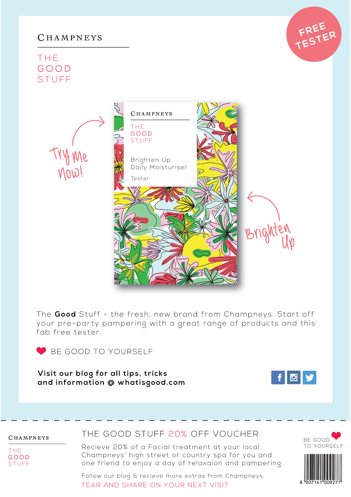
Magazine Tester Insert


By having this mock up in the magazine it allowed it to reach the target audience and allowed them to receive a free sample which could influence sales. 


Mail Out


We feel that the print could be made better but the designs work as a basic function.

I feel that if we had more time we could of developed this further to reach the audience in a more modern approach. The designs work as quite an interactive fold out so will enhance consumer interaction with Champneys brand. I believe that the design function well but we will leave to see what they are like when they are printed.

Wednesday 19 March 2014

The Application Process

FIRST EXPERIMENTS 


The initial Designs for the application:

I got started on the application that the users could pick and learn about Chamoneys spas and high street stores + benefits of specify treatments. 

We wanted the layout to be very simple navigation. The design needed to be inclusive of the blue for the online digital stuff. 

We also wanted to include images within the application that would reflect the target audience. 

These designs didn't work in terms of layout, image and application process. We dixovec that the printed pattern was very hard to put into the app without looking too dominate. 


SECOND EXPERIMENTS

After this i STARTED AGAIN, Working on the application layout and navigation and how it would be handled by the user: 

After the above designs, we decided to take a seat back and re-think the application layout once more. We decided to go for this: 


A simpel layout with a grid system that allowed the user to identity with aspects through a square shape.

After working out the layout we decide to start adding in aspects of the app. We changed and adapted the square shape to rectangle shapes so that the sign in and up page could be written on.


Keeping amid between image and text through the simple layout. 
We decied to add a grey background to balance out the application Differnet shades of blue represents different products and treatments and click-able links. 

We throughout this could be effective in the balance of the app and for its navigation. 


Overall we thought that the application worked well with the print and packaging products even though it had a different colour scheme. It also reflects the same messages that we put in the blog:

Beth worked with me throughout this, adding tips and opinion on layout until we came to this conclusion. 


Research and Develpoing the Print and Online elements

Developing the Print:

We looked at some layout research that you would find in magazine.

The pages were very busy, bright and full of information.

We felt this could work well for mocking up a magazine presence, as our target audience buy and read magazines like this. 


The research helped me to layout a magazine mock up for the sub-brand. We wanted to create a incentive so we made a free sample to go with the advert. 

MAGAZINE EXAMPLE:


We thought that the magazine advert would look effective if it was mocked up alongside a page from an actual magazine. 

I feel that the magazine works well to entire the consumer and explain what the champneys product is all about. We placed it within the beauty section of the magazine to give the design more background. 


ONLINE Elements: 

I created a twitter account for the Champneys brand that would link to the blog. We wanted to incorptae the print pattern with the digital presence to unify the brand.


We have neglected the online presence of Champneys apart from the blog. If these went live we would have tweeted as part of Champneys range. 


Final Print Magzine Mock up:


I feel like these extras allow the brand to seem real and more live. We had a crit on the magazine and the majority of people said they valued the fact it was a free and friendly information point.