Saturday 4 January 2014

Design Concept

I wanted to portray myself as fun, creative but also demontste my design skills with type and gird. 


Friday 3 January 2014

Champneys - Research

To develop the brand we decide to look at the Chan=mneys high street stores and retail:

This is a Champneys highstreet store…. 


The store sells products and spa treatments without spa luxuries and allows cutormers passing by the opportunity to get a treatment. 

The products in the spa:

The products range from boring to bland. The design colour scheme varies a lot and it seems as if it's catered for an older target audience. 


Even the younger brand layout and colour doesn't work well to cater for its audience. It uses a very bright pink thats too garish for the products. 


Overall the spa needs to resell and rework to be suited for a younger market. The designs need to be fun, bright - but not to garish and corporate They also need extras to make the brand accessible and work for the market. 


Design Sheets

I have started to mock up some designs for the layout and function / navigation of the website. This is has helped me to start to visualise the website. I have chosen specific headers and worked on how the design will work. 

I feel that a very simple nab bar with one sub nab bar per main page could work well. The design needs to be simple and to flow in chronological order so the user can get as much out of the website as possible. 

Main points;

It has to allow the trailers to be seen clearly and linked with other similar pages

It has to be clear / easy navigation

The pages cannot be over  complicated. This is to showcase a difference between other film websites as they are often crammed and full of irrelevant information, taking away from the vital film news, updates and trailers.

It has to look visually pleasing for a young professional audience, as well as film lovers. It needs to ONLY include relevant information. 

Thursday 2 January 2014

Colour Scheme Re-think

Working on the brief and colour scheme seemed to automatically go the blue. I do like the impact it has but i feel i could experiment with the shade of blue to see whats more appropriate. 


I need to work out what shade of blue will go with the grey background and the black for the copy. The bright blue does jump form the page but I don;t know wether it will look professional with images or weather it will take away the impact of the image. The blue colour needs to be bold and eye-catching. 

I feel that this blue represent what i AM TRYING TO PORTAY. tHE NAVIGATION will use this colour giants the black of copy. I think it will allow the users to see and use the website appropriately. These 3 colours work together well and i feel that it works with the idea and concept of the website. 

Wednesday 1 January 2014

Splitting the Brief

After looking over the brief i thought it would be appropriate to split the brief into 2 separate briefs.

1. To create a website that would build hype around trailers and film information monthly that could enhance cinema viewing.

2. To create a cinema that is unique. Brand the cinema and create a concept that allows more people to experience the cinema. 

I thought that doing this could allow me to spend more time on the briefs individually. They don't have to relate to each other but it would be a creative way to get people online to be able to see new films clearly and get excited for film.

The cinema could then just be another way to connect with the intended audience. 

I am going to keep the two briefs completely separate. This is because they will work on two different platforms. 


Organising the Content : Layout

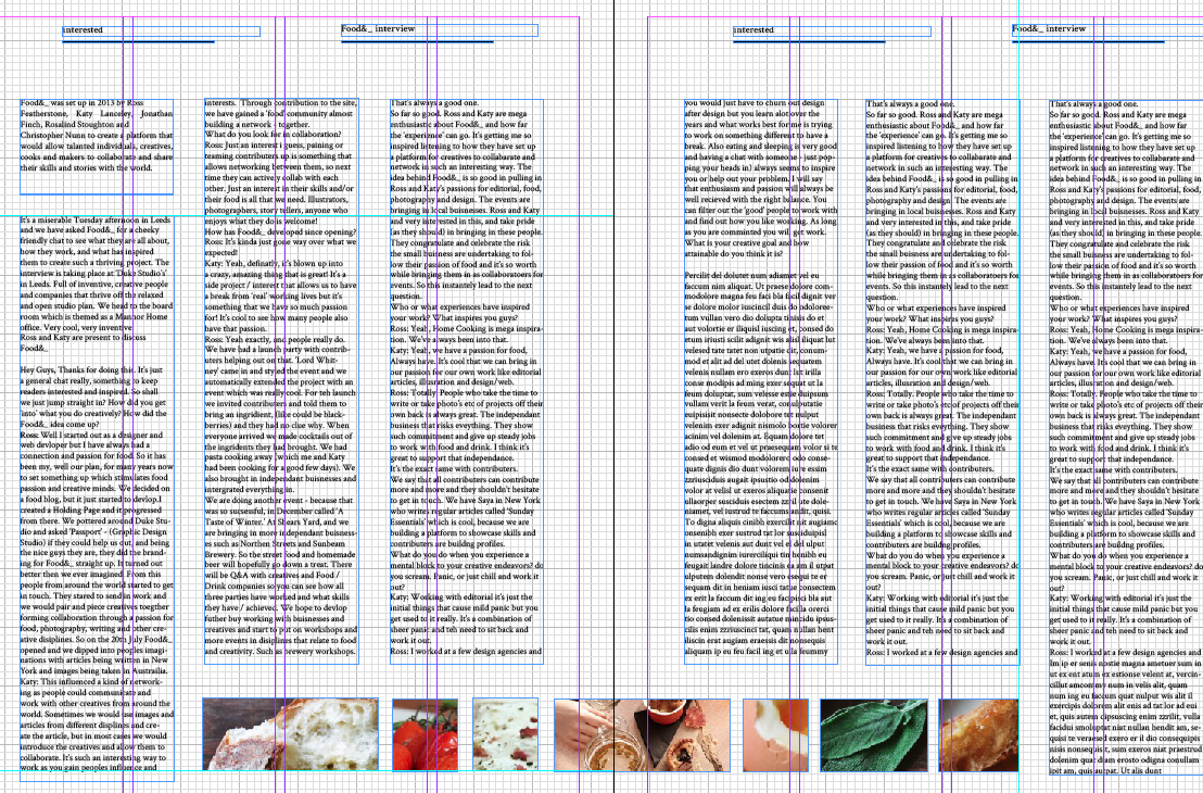
I had some difficulty with developing the layout. This is a very early draft of the potential layout which I feel needs a lot of work. The design focus on experimental layout.

I want the pages to include a variant of interview and text to allow the audience to actually read the content and learn / be interested in...


I feel that these pages look too text heavy. The interview needs to be more spread across the pages to allow for a simple and easy read.


The image layout is becoming more and more difficult with more I had into it. 
I feel that the layout is too busy for the design.


Contents page layout:

The contents needs to be simple, coming straight from the front cover I feel it could look overworked and crammed. The design includes a combination of image and text but may have to be re-wroked in order to fit with the theme and content.


I quite like the layout of the food& interview. The images work well in a uniform fashion. 2/3 image per page could work in terms of spacing and allow for the visuals to not be too crammed. 


I need and introduction page to each interview. I feel that taking up the page might include too much negative space which could look unbalanced comp read to the busier pages. 

I think I need to re-think the layout  and placement of specific pages.


Products Same Price Range and Quality of Champneys Research

RESEARCH:


This is quite refreshing, but I feel that there is too much type that takes away from the essence of the brand. The slight illustration does work however. 


Products in the price range of champneys high street retail products.

These are all quite boring and bland, not one stands out compared to other products. I think they also look quite corparet and cold.


The colours used appeal to young girls but the packaging is quite boring for the product. The layout however works well and displayed the type and information in a formative and clear way. 

Too much decoration on the design takes away from the range. I feel that these look visually pleasing but they designs I personally feel do not work to describe beauty. 


Size, scale and from of container is very important to beauty products and Ifeel that a variation will be curtail. iT SNICE TO HAVE A FULL RANGE AND NOT JUST ONE SCALE. 


This has to be my favourite, but i must admit the design doesn't scam fun. It is quite formal but i feel that the type has been set to a high standard that it still looks very appealing. 


Exploring TypeFace

The type I have used for my logo is ARIAL BOLD, I increased the text and arranged the lettering so that the text fits in the middle. 

For the logo on web format… I have experimented with various type. I want to reflect the same idea but it needs to be more controlled. 


The type explored is NEXA BOLD and NEXA LIGHT. I feel that using the typefaces combined looks appropriate for what I need.

the colour is quite hard to reflect, I feel that the weight of both fonts compliment each other. For a secondary logo  I think this could work, introducing the blue colour scheme and black for content. 

Print Collateral

Print

Starting to create and push the identity into printed products. The design needs to still be simple for the older target audience. I decided to keep the business card as one header for the menu of the range. I wanted to portray it as a professional yet personal approach. So added in the tag line of scrumdiliYUMscious. 


I feel that the layout of the menu works well to allow the audience to browse easily. 
The colour scheme is also tonal so it works with the image and the 'homemade' tone of voice. 

Order Information and Reciept 

I wanted to include a different image here to explore the changes in layout and overall look. I used the same grid as the menu for the back of the order information. It was based around a receipt and still needed to include a lot of details. So by spreading out the formation I feel that it pushes the brand . 


 I think when these are printed i can decide wether the designs work well together and look coherent. 

Sunday 29 December 2013

Initial Digital Designs

My initial thoughts from receiving the briefs and coming up with the general concept was to jump on the computer. I know that working like this is normally too rushed but I felt that I had to create my
 designs while i had the initial thought. 


Creating new poster designs that would be re-made for the website. 


Apply a mock up to an iPad. the user would see the poster and could scroll though. I haven't really thought of the design and how it would  work as of yet. These are just my initial response to the brief. 


I wanted to get across the fun and lay full ness of the brand. I do feel that these designs do not work well to get across my concept however, I need the artwork to look more designed to a uniform standard. Also the designs I have created do not work together. 


Sticking with the bold type seems to work well, however it doesn't work as well with the above image as it did with the previous. I think it re-designing the posters for the website would look to confusing and slightly mis matched. I rally need to re-think my plans for this and see what I can change / keep the same . 


After creating the designs I realise that I will need to work more closely with the design. I think the designs start to set the scene with these but I know that I'll need to do a lot more work on the designs. I also feel that they could be developed by sketches. I need to re think my idea, take out certain aspects like the colour scheme and the web layout and logo and really start to push the concept from here. 

Condiment Illustration

Illustrations 


I wanted to include some illustration into the design to keep in theme with homemade and triton. I wanted the illustrations to be a mix of detailed and not so detailed drawings. 


Once I did these illustrations I decided that I could manipulate different related condiment ingredients and create an almost pattern and wallpaper effect.  


I feel that this design really gets across the tone of voice, The detail on the design could work well for packaging and food wrapping for the condiment range.