Record Sleeves:
Lorde:
What is Team?
Images based Record Sleeves:
Saturday, 18 January 2014
Secret 7 : The Brief / Plan
Secret7
"We take 7 tracks from 7 of the best-known musicians around and press each one 100 times to 7" vinyl. We then invite creatives from around the world to interpret the tracks in their own style, resulting in a one-of-a-kind sleeve for every 7”. The creatives are made up of famous names through to gems we unearth through artwork submitted to us here on our website."
Every year we like to mix established musicians with emerging ones. We were thinking the latter when we first approached Lorde but she raced ahead notching up a #1 single and a critically acclaimed album. Team is taken from that, and will be her next UK single in February.
I decided to focus my attention toward the Lorde - Team.
I have decided to do this brief in 2 days. I am using it as a break from the bigger briefs within this module. This is a competition brief also which adds to the list.
New Sketches / Updates
Since the feedback crit I have started to sketch and digitally play around with some new ideas. I feel that these could be applied to the original designs and I can really start to push the concept. I want the pages to feel applied and informative.
Sketches:
Digital Changes: / Updates


Sketches:
Digital Changes: / Updates
Change in Title
Creating new text:
Cutting sections out of the logo to create a 'see through' text works well.
Change in navigation:
This was to gain specific pages. I wanted to include a news feed and felt that it was vital to keep the intervative aspects. o i separated the design into sections. Each section allows you to click and follow up on a story. Some however, are just solid text of news. This helps the user to not get too distracted and distance themselves from the sight when they have clicked on a link.
Need to work on;
I made the changes since the crit and the site now makes more sense. I really need to work on my positioning. Some of the text is too left aligned and off blanches the page. I also really need to work on more pages. I feel that so far i have not created enough for a substantial brief.
Whats Postive;
I do like how the page works overall. I like the background image and low opacity overlay. I feel that this adds depth and layers to the page. It also allows for clear navigation
I like how the page only allows you to four son one or two thing MAX. This way the user is getting the most out of the page and can work with minim and informative content. This can then be applied to the user and allow them to get excited about seeing the film at the cinema.
Friday, 17 January 2014
Re-working from Feedback
One of the main points from my feedback was that the design was too much aimed at women, I have developed this with a change in colour, which automatically prompted some layout variation.


I have started to layer up some pages in terms of type and image to create some excitement and variation on pages. This should help to also separate the pages and keep it fresh yet still legible and informative.
I feel that this will work through printing also. Having bold blocks of colour should bring some depth and variation to the pages and this could look good when printed.
Secret 7 : Initial Response
- Original ConceptThe orginal idea was to use the word 'team' literally. I wanted to create a sense of collabaration and togetherness so that the designs portrayed Lorde's idea of being on the same team. I took polaroids of hands tied together to show unity but i felt that it wasn't a strong enough approach.I took some scans of my designs to see what the process would be. I decided to use polaroid to utilise the 'independent' music that Lorde creates. I thought that it would also give a nice approach to the photographs.
I got the concept of this image i found when i typed in TEAM to google.

My Scans:


I feel that these images do not work with what I imagined. The photographs are not detailed enough and the style of image doesn't work as it looks to busy.
Before I go any further, I think that attempting to manipulate the image could work quite well to ensure a proper use of time and to see if the original concept can be improved / strong enough.

I manipulated the image into a combination of images. I feel that the design is way to simple and doesn't portray the sense and concept of the specific lyrics that originally was planned.
How to improve:
The design could improve by adding texture, or some form of fluidity. I think that this could symbolise unity and team in a none obvious way which could be more throughout provoking.
Ideas:
I decided to take certain aspects of the images of the hand scans and manipulate them to create a pattern / texture:

This image to far to green for the idea but the movement the image goes i feel works well, however it needs a lot of work.

I attempted to add texture and tone to develop the image but I still feel that it could be more original. I think I may have to go back to paper to get the exact affect I need.
Young, Fresh, Packaging research
Packaging Research
Google images
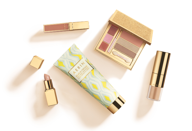
Using a simple pattern, with the gold of the container works well. Its still got a young and fresh appeal.

Pentagram
These are very cool, but i think slightly too corpate. The idea of doing something completely different is appealing however This works well in terms of colours a each product range has a colour scheme.

I really like the texture and pattern used within this design. It allows you to really experience the personality of the brand. Also the shape and detail work very well to make the brand girly, fresh and different.
Research into Logo Design
Research : A designers Guide to … Logos
I have found a website that allows basic research, comments, tip and advice on design and certain aspects of it .
I have found this blog and this article a great way and starting point to tackle my personal branding. Its effective to working on my logo and branding.

I have found this blog and this article a great way and starting point to tackle my personal branding. Its effective to working on my logo and branding.
This article builds upon the tips submitted by freelancer designers to the original Guide To Logo Design with those kindly provided by design studios, plus a couple drawn from my experience of reviewing their work for BP&O.
Each studio was asked to contribute a piece of advice that focused on the commercial realities and everyday practicalities of logo design today and that would help new designers manage and deliver their own effective brand identity solutions. Edited and curated by Richard Baird.
Is a new logo necessary?
It is important to understand the equity of current assets. You may well be tempted to suggest a new logo but a good designer knows when to leverage established assets, give them a new context or make minor changes to improve legibility across new mediums. The dialling up or down of a logo’s prominence within a brand’s communicative activities can be far more effective than a complete redesign.
Provided by @BunchDesign - Website
The value of a logo
The value of a logo seems to divide opinion within the design industry. Some see the logo as an outdated piece of the brand, others (like us) see it as the key to great branding. It can be the hero, or take a back seat and allow clever use of brand assets – inspired by the logo, to tell the brand story.
The logo plays a different role depending on the size of the company, their budgets, and requirements. Regardless of the size of the brand/business a logo can be a vital piece of a businesses brand toolkit. For startup businesses on a budget, a logo is an opportunity to communicate the core business idea or offering, and with consistency and repetition can help a brand quickly become easily identifiable. For an established company – the logo, if distinctive can form the basis for an ownable, visually distinctive yet diverse and progressive brand identity system.
The function of a logo should be sensitive to the clients business needs and should play an integral part in the brand identity.
Provided by @DesignersAnon - Website
Avoid designing in isolation
A logo is a component of a brand identity system and should never be designed in isolation. However, it will often be seen as such in application and should act as a recognisable shorthand for the brand it represents. For us, the most successful marks implicitly covey the brand’s core idea and/or offer. Brand positioning, values and personality all inform the ‘styling’ and realisation of this concept.
Provided by @teamkaroshi - Website
Learn to tell stories
We usually try to avoid using industry clichés and buzzwords, however, one which we came across recently seemed to resonate with us. ‘Storytelling’, or the idea at least, of telling the whole story of a brand, product or service through not just a logo, but a variety of brand touch points whether that be print, screen or environment. Creating lasting, relevant and impactful brand identities is like writing the introduction to a good book. You lay a solid foundation with the logo or marque itself but then build in a variety of chapters which help tell the whole story through the use of specific visual assets such as typography, pattern, colour, texture, audio, video etc.
You’re logo is the most visible representation of your business, product or service, but it requires support, and a variety of considered, sub plots which, when applied strategically together, work to successfully tell your brand’s story over time. These assets allow the life of a brand to evolve and more importantly adapt to their constantly changing environments. It’s not just how good a designer you are but, more importantly, how good a storyteller you are that will define the success of your clients brands and indeed your studios output.
Provided by @FreytagAnderson - Website
Try to avoid a logo-centric approach
The market for logo-centric / logo-only solutions continues to grow. It’s evident in the rise of 99Designs, off-the-shelf products and market places. The way isolated logos are treated with such reverence on-line and rendered to the nth degree. The celebration of grid, guide and golden ratio based precision. And the abundance of logo-only galleries, books and blogs. These all reinforce the idea that a logo is the communicative silver bullet that business owners need to engage their customers.
The reality is that today a logo should really only be one small part of a more generous approach to brand communication, one that in my opinion all designers should aspire to take.
A designer should help their clients to appreciate and embrace the changing brand landscape, more expansive yet cohesive opportunities and the increasing expectations consumers now have. Inexperienced designers should look to more communicative assets and shake any preoccupation with just designing a logo. Even if that means securing a few printed assets, or to help their client with images, language choice, materials or print finishes. If you’re commissioned to design a logo, and that’s all the budget will cover, provide your client with a strategy on how this might be complimented by other experiences and assets in the future.
Provided by @richbaird - Website
Keep it simple to best utilise print finish
Think of a simple way to create a visual representation of the core business ethos, then simplify it. Try to stay away from bevels, highlights and other enhancements, so it works as a flat image. It can always be interpreted differently by process, substrate or application.
Provided by @RobotFoodDesign - Website
Reduce and refine
The world is a busy place. Try reducing & refining your designs until you can’t take any more elements away without hindering communication. The reduction of unnecessary elements enhances clarity, reduces confusion and produces optimum effectiveness.
Provided by @studiojubilee - Website
Bring execution ideas into the conversation early
People typically remember a creative execution over a logo concept, so bring execution ideas into the conversation early. As part of the identity presentation, consider current/potential touch points that you see as design opportunities to bring it all to life. They’ll thank you.
Provided by @perkybros - Website
Do you even need a logo?
Clients will always want to quantify what they’re getting and will think about things in terms of what’s been done before, or what everyone else is doing. Designers should always be thinking about what hasn’t been done and starting from there. Some of the strongest identities work when the logo isn’t even present, because everything around it has the same care, attention and thought.
Provided by @ostreetstudio - Website
A logo is “just” part of a bigger picture
A logo is “just” part of a bigger picture.
We would even argue the relevance of a logo.
A good logo in an unconsidered environment will still look like a bad logo.
A logo and it’s environment (visual identity) need to be considered in the development process.
A good creative brief will hold the answer to the outcome, not the work of your colleagues.
A good logo can be “ugly” and therefore memorable, to often energy is wasted on slickness.
A logo and it’s environment (visual identity) need to be considered in the development process.
A good creative brief will hold the answer to the outcome, not the work of your colleagues.
A good logo can be “ugly” and therefore memorable, to often energy is wasted on slickness.
Provided by @TokoDesign - Website
A small part of a larger system
A logo is just a small part of an identity system. The logo doesn’t have to communicate everything by itself. In fact it most probably cannot. The elements of the system should work together to create the full picture. If you are creating a logo for an arts/community/funding organisation – see what it looks like in a logo park, because it will spend some of it’s lifespan existing in that environment. As a designer, a logo must be as much a reflection on you as it is a reflection/representation of your client. Otherwise, why would the client come to you in the first place.
Provided by @GraphicalHouse - Website
Avoid instinct
Instinct really is for the experienced. For everyone else there is design strategy. Whether that be mind mapping, brainstorming or a written evaluation and approach, strategy before design can help to manage expectations, outline intentions, identify the most appropriate design tools for each message, and force you to reflect on the communicative effectiveness of your decisions without the bias of a well resolved but aesthetically superficial design solution.
Provided by @richbaird - Website
Keep it simple
If your client is looking to convey multiple values, try to avoid compounding these into a single asset like a logo. Look to materials, print finishes, language, image, sound, environment and digital experience to find the most efficient, effective and compelling way of delivering key values. This will mean that you can keep your logo simple and use other more appropriate and effective tools to be creative and communicative.
Provided by @richbaird - Website
If all you have is a hammer, every problem looks like a nail
A logo is often what a designer wants to create, not what the audience wants to see. If all you have is a hammer, every problem looks like a nail. Behind the clap-trap, ‘Branding’ is simply a product, a service or an organisations reputation. This reputation is managed by actions. One of these actions is the development of an ownable visual identity deployed across channels of communication. This identity traditionally revolved around a symbol — namely a logo. But now, with so many channels, and the ability of the audience to respond via social networks — the launch of a new brand with little more than a logo at the helm is very likely to end badly. Often almost before it begins. New logos are ineffective when it comes to looking to create a strong way to signal who’s behind what. The business landscape now dictates a wider set of assets for contemporary communications. The old hero of branding — the logo — has well and truly faded. It can however, still play a part within a wider cast of communication tools. Products, services & organisations that embrace a world of designed assets win the commercial race.
Provided by @SomeOnes_Tweet - Website
Should you be designing the logo first or last?
It’s important that designers, like agencies, take, or aspire to take a strategic approach to their design work. That means spending time understanding which assets deliver the most effective communicative impact and allowing these to inform the design of others. If, for instance, the most influential/memorable brand experience is likely to be packaging (it’s a great canvass for both physical and graphic treatments), then focusing on the logo first and allowing it to inform the packaging wouldn’t necessarily be as effective as working the other way around. A logo plays less of a role today in making a brand memorable than it has done in the past.
Provided by @richbaird - Website
Understand your client
Don’t even pick up a pen until you are satisfied that you fully understand your client, their vision and the business they are in. Ask questions, meet up, workshop ideas with them if you can. It will get your relationship off to a healthy start and it will save a lot of revisions and ‘do-overs’ further down the line. Don’t underestimate how critical this early fact-finding stage is to a successful project.
Provided by @wellmadestudio - Website
The future of identity design
The days of a single marque applied dogmatically and uniformly are gone. Contemporary identities still need to succinctly capture and convey the essence of an entity, but must also be flexible, layered and responsive. The concept of ‘unprogamming identity’, i.e. focussing on designing a process for identity creation, rather than a static outcome is a consideration in all of our identity development projects.
Provided by @manualelectric - Website
Revolution or evolution?
Everyone wants to put their own imprint on things but sometimes it is far more important to acknowledge the fact that not everything needs to be overhauled and revolutionised. Sometimes a designer can spend too much time, effort, and client budget on trying to produce a new logomark that has no affiliation with its predecessor just to justify the design fee. Look at what already is available for you to work with; you’ll be surprised to find that at times the right idea is there, in that old logo. Perhaps it just never got executed well to deliver and communicate properly and all you might need to do is help it evolve, allowing you to shift effort, time and money in other aspects of an identity exercise.
Provided by @StudioMother - Website
I
Thursday, 16 January 2014
Feedback
I have gathered some feedback on my new layout. I think that this will help me o explore my brief more and see if I am heading in the right direction.
I left my work on the table with some pieces of paper for comments:
+ I feel that the simple layout is effective but try and be different in terms of your layout
+ The image quality looks blurred
+ I don;t thinkt the pink would work for male perspective. The design looks quite feminine at the moment maybe play with another colour that could be used.
From this feedback i feel that my design will need further work to develop the theme
Feedback
To gain some more knowledge and insight into how my designs were developing I decide to present my ideas to TOM in the studio. We sat down and i went through the pages I had created, Tom feedback was very helpful and he offered me futehr insight into how he through the design could be improved and adapted to suit the user and concept:
- To change the navigation on the top to by taking off the 'ABOUT US' and changing it to 'ABOUT'. This was to increase the proffeionalim of the website.
- Tom also suggested that 'cut out' the white bit of text within the logo on the homepage, and place and image as the background so the image comes through the text.
This would make the website more exciting and start to unify the designs.
Tom also gave me adve aout navigation names and where to place certain objects on the page.
He also gave me some helpful comments about he aesthetic saying that it was visually pleasing and that the layout is user friendly.
I thought this crit was very vital to my practice as I have now gathered more insight into how a webiste works. I need to start making a lot of changes on my design and really push them.
I intented to create the whole website and create pages for each navigation header and the links to those pages. I feel that if i create the whole website my brand could really start to co-develop with my concept.
Development
The bold background seems to clutter up the space between the logo design and the background. The darker colour of the background is also very cluttered compared to the previous.
I think this distracts from the main page layout.

I have started to work out some of the pages. I wanted to create a smile navigation system.
By viewing the page monthly I can start to oriagnise the content. The left hand side column organises the months and the up and down arrows show the films but only allowing three trailers to be shown.
The trailer offers a drop down menu. This allows the user to identify with certain aspects and make the traiers and content personal to them. The trailer also as a + sign which means that the use can add the film to their watch list. Which means thats the use can control and select vital and important information.


The same layout was applied to the top picks. This page references the most watched and 'watclisted' trailers on the website.

I went back to the original layout for the review pages. I Thought that this would bring would make the website more complete and cohesive. The design works on a sidewards click motion. The main trailer poster comes through with the side ones faded, they will become clear when they are prominent.


I feel that the different forms of layout work well within the film website. I still want to expeiermnt more with layout within these pages. The designs and navigation need to work as indical pages, each pages needs to be specific to the users needs and wants. I feel that these design could be improved to allow for a more detailed structure and user reliance.
Subscribe to:
Comments (Atom)