Saturday 15 March 2014

Application Final Design

The application:


I feel that my final designs are effective in portarying a sense of professionalism to the targeted auidence . The target audience needed a quick and easy application that tackled the key barriers affecting them playing tennis. This application tackles having no one to play with my the double up app pages. The application also was aimed at sports and women so the colour scheme needed to reprints this without being steotyprical. The images are added in to inspire women and reflect the aspiration tones. 

Friday 14 March 2014

Newspaper Club samples

I ordered in some samples to see if it would due the approbate stock for my designs. 

I wanted to see what scale the designs could be, how the colour would print and other details. 


I found it very useful to get these prints and it led me to make some curtail decidios about the prit processes and stock consideration and how it related to my content . 

Champneys App Initial designs


Creating the App

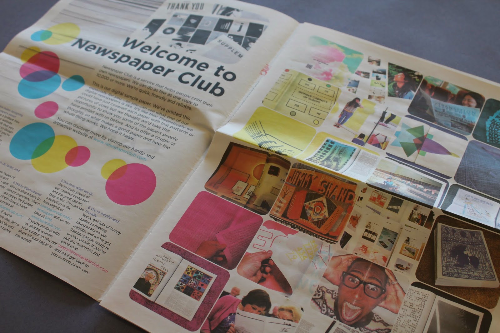
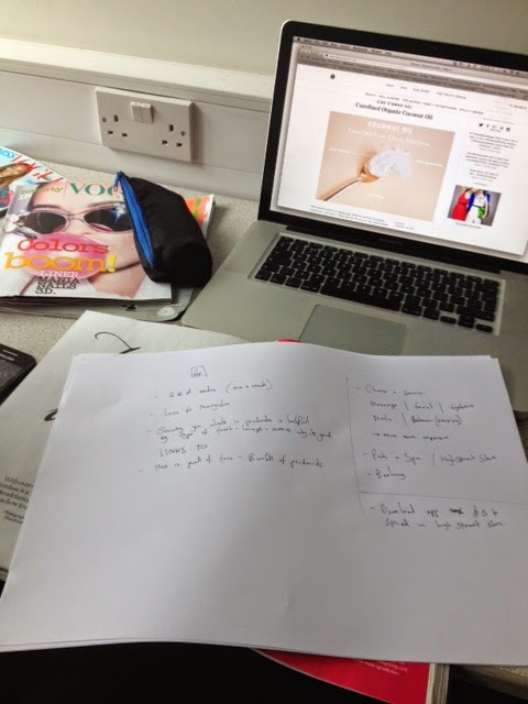
I started work on the application

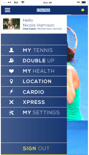
We wanted the app to very simple, easy to navigate and have a basic template. We wanted to include images but we also needed it to very simple so that the user can quickly flck through for information and bookings.

The layout changed throughout the process. At first we decided it could look nice if all the sections were merged but and sectioned by icons, but the design looked too cluttered, so we decided to space out the layout.


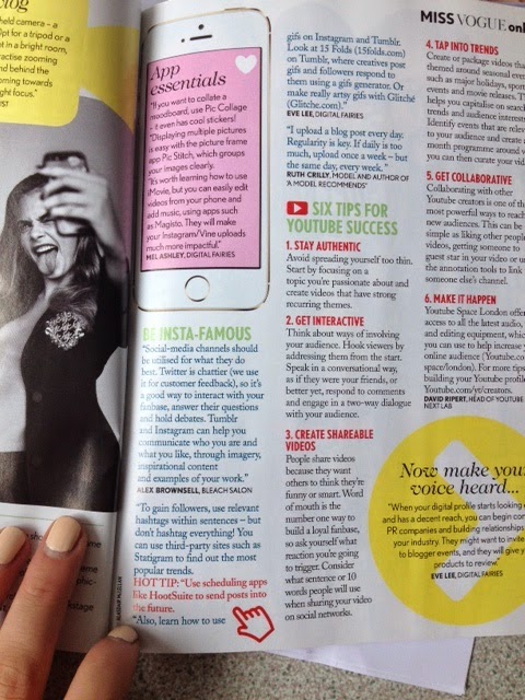
Adding in the text and photo's became more focused when the layout was mastered. 


We wanted to make the app as interactive as we could, so we added in specific tap and drag sections that allowed you to see the benefits of certain treatments and products

We thought that this was beneficial for the audience and could clearly portray the information without overloading.


The home page looked quite boring with just a white background, even though we wanted the visual to look fresh, it just wasn't working. We decided to add in the pattern to bring the print and digital aspects together. 

This worked well as it gave the app depth and merged well with the products. 


Thursday 13 March 2014

Champeys Blog Inspiration


For inspiration we headed to the library to see if we could see how beauty in magazines is portrayed and how it works with online and digital applications.

Mag:


From here we wrote down some ideas for the application we were thinking of making. We thought that this interactive element would make the brand inclusive.


We wanted the application to be personal and show the benefits of a specific spa treatments or products. We thought an interactive swipe and tap section on the app could make it fun and more suited to the audience. Also gives a preview of the benefits. WE also thought that the app could how some sort of credit system for the clients to boost reliance and sales. 


We had a mini crit and we spoke to Simon and he suggested that we look into forms of media that are target audience would use and look into creating an effective identity instead of just print and application 

After a brainstorm me and Beth came up with the idea to create a young, fresh blog that worked t iintroide the good stuff, the products, interviews, tips, healthy eating etc,

We thought this would be an effective way to meet out target audience.


Tuesday 11 March 2014

Creating the Labels

LABEL DESIGNS

I started to work on some labels at the front. I didn't want the labels to be too busy as the pattern was obviously a main focus with this brand. The designs needed to be worked out on a grid form so that we got all the information in the right order of eyesight. 

Once I worked out the overall look, we applied this to the whole range.


I think that designs look very clean and simple, which adds to the approach we were trying to create, It adds a sense of professionalism to the designs and packaging allowing it to seem lie a real product and for it to be informormative.

I had some trouble with the back labels. The layout wouldn't work. wE WERE ALSO CONCERED ABOUT ADDING IN TOO MUCH INFORMATION that was irrelevant. 

So we just decided to put on the logo _+ name. 

Back labels


I feel that the back labels do look quite boring but the information on there is relevant and the ingredients list is also applicable.