Starting to design:
(I do NOT own any rights/copyright to the images used in my designs)
I have decided to create a website that allows women to explore and look at all the main points listed in the brief. I believe that this could work as the brief is aimed at professionals and the average working women will use the internet on a daily basis.
Experimenting with various type and word play + Image:
I think that these designs are way to simple, but as a starting base, they get across a powerful and inspiring presence which is effective.
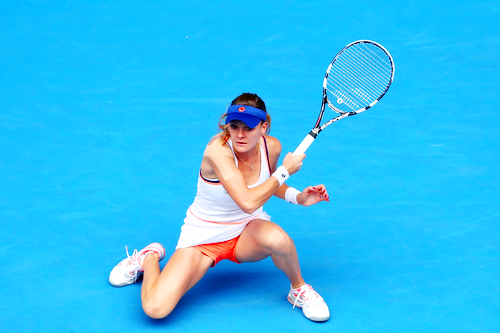
The colour scheme : The colour scheme is very important to the brief, and as most of the images i have collected on court, i believe that I should use blue and yellow in my design.


To get me started I experimented with various images and word layout to see how I could use the different aspects.
Website Mock up:
Pushing the designs further I wanted to develop the website layout before I pushed the promotional work just so I could get the concept down and see if it worked well / user friendly:

Adding in Images:
I used some simple layout structures and began to build the design in a grid form.


I started to find the layout quite complicated and the hiercahy of the images were wrong. I feel that the design looks quite professional but needs more work,


Display and Layout:
I wanted to create landscape full screen webpage. I wanted to oak up the click-able links of videos and interviews.


WEBSITE MOCK UP:

Developing an Overlay:
I thought that the images worked quite nicely with a blue overlay - so i tried it on the below designs;


I think the aspect of doing something digital could work with the concept but I feel that I could push this further then a website and make it more personal to the user.
I feel that an application could benefit this and would work better. I could take these experinnts of layout and apply them to an application layout to see how it could work on a smaller scale and monitor.