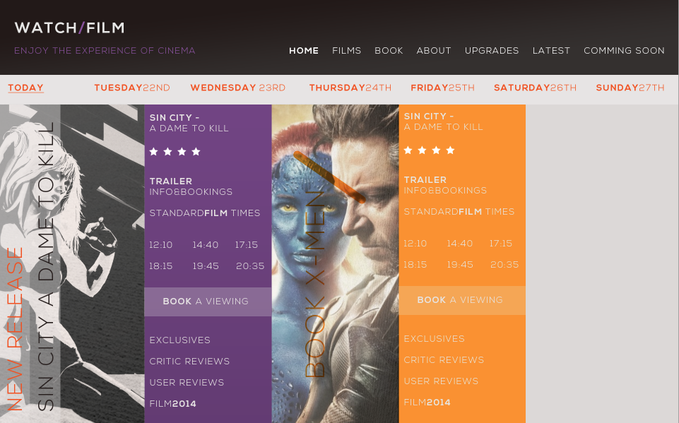
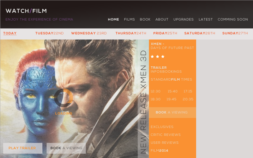
I have started to develop the website form the designs i drew up. I thought that incorporating the colours of business cards and printed collaertal would work rally well. i like the structure and layout of the portrait columns on a landscape format. I think this really works to add charter to the design


Including the right images really makes the page format change and develop.


Trying to incorpate the logo into context


I think these sections have too much detail on them. I wanted the website to be simple cease the layout was busy so i think il have to get rid of some of the text on these pages of the website.


Gradients and greyscale varitaion to see if the design worked better with the / shape popping the colour.


I really like the way my website is heading. Its clear and ocmunicates the message clear. It looks visually pleasing and very relvebt to my concept. However it might be slightly over complicated so the design and the text may need to be simplified.
No comments:
Post a Comment