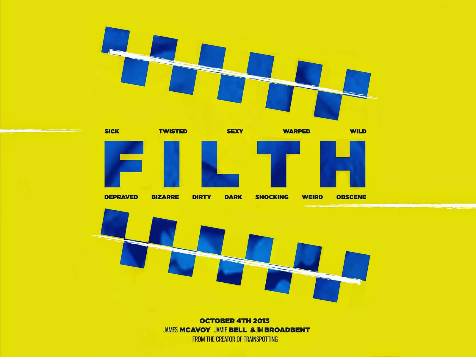
The design focuses round the poise research i undertook an then uses white lines to represent the drug use within the film. i PLACED A GRADIENT ON THE BLUE CHEKCaRD DESIGN SECTIONs to gee them more depth and charter. Then i used an image to overlay the image and title.
I am quite happy with the final design and feel that it works with the conenpt.
iF I HAD MORE TIMe i would work more with the design and create maybe a not so gridded outcome. However I do think the design looks quite professional.
No comments:
Post a Comment