Personal Branding + Identity
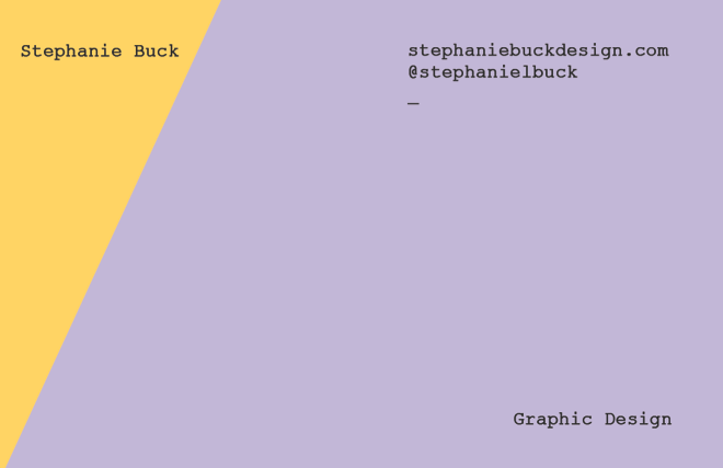
After looking at the development of my branding I thought it needed to move in a different idrestcion. i still like the essence of colour and boldd type but I would like to bring in different variations and design. I still don't know we her to call myself Steph or Stephanie. I think that I will have to develop my plans further.
Playing around with style:
I really like the diagonal shape / colours in this design. How it also connects with the A within the type is effective, however, the design is very similar to that of which i researched, so I can't use the same style.
Bold initials. This works on my initials, however i don NOT think that the design works. It is very simple and doesn't really have anything to it. I do like the diagonal line in the previous designs so i feel that i should incorpate that.
Using the same colours but adding content. I think the design is very basic, it doesn't really work for a final piece but the development of these designs is keeping me inspired and intrigued.
Playing with text formation:
I think this kind of works, It includes the diagonal of colour but its quite hard to read. I think the colour scheme contrasts a lot also which gives the design a 'hard' edge,
Development
I feel that this is quite similar to something I would like. The design is gridded which i like, it also includes colour, I think i need to mix things up with the design however, as it looks quite boring. Adding a grey background allows the colours to 'pop' but i still think it needs a lot more work.


No comments:
Post a Comment