Initial Label Designs:
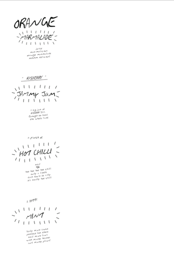
Trying to be in keeping with the homemade approach I hand rendered some designs. I wanted it to look like a scribble effect.
I soon realised that the design didn't work with the YUM brand and seemed to bring the professional aspect down. I feel that if i included some for of image and colour and the original LOGO it could enhance the tags.
I tried to get out of the original shape and style of the tag, I feel this could of been interesting but after these experiments I would prefer to keep it in a retcnage shape.

To develop the range further I had to start creating labels for the condiments.
I wanted to create a simple and clear design. I have included blurred photos to back up the label and make it look professional.


I feel that theses labels work quite well in terms of working with the YUM branding. The designs are very simple and have a tear away section that allows the audience to write messages to people they are purchasing the condiments for or a little thanksyounot.
I think the colours work, because of the photography, but the design layout needs work and the YUM logo in not centred to the label.
No comments:
Post a Comment